The influence of classical architecture on later architecture
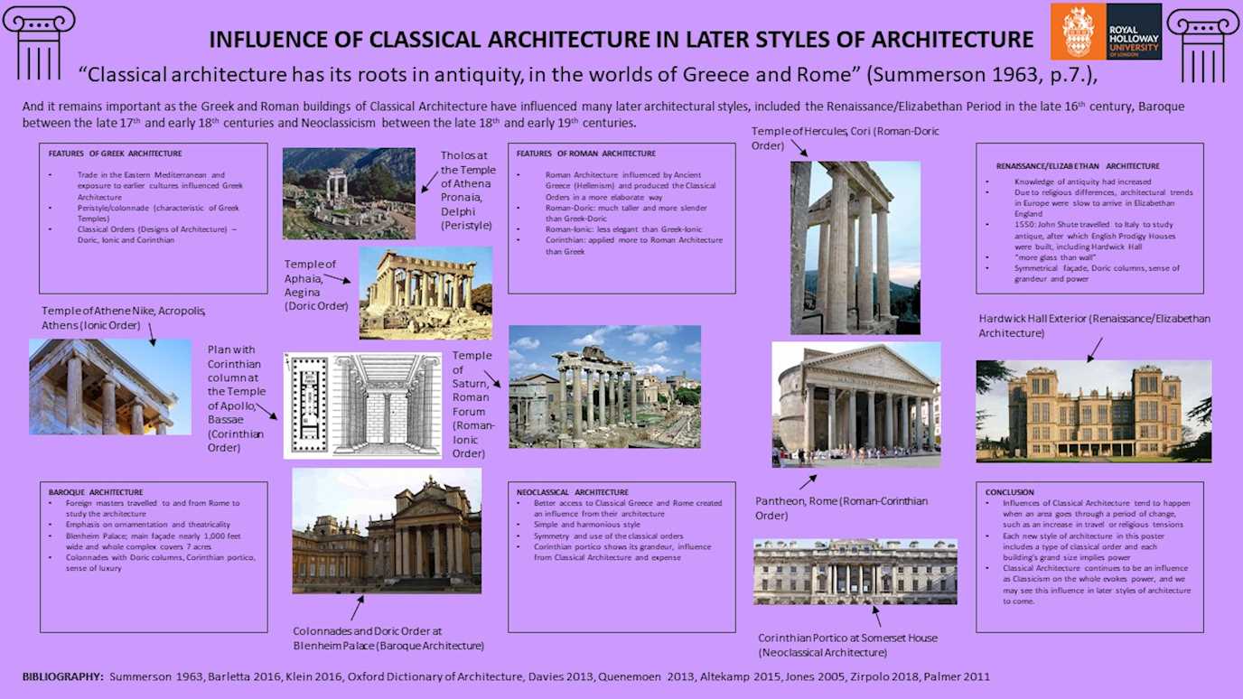
Firstly, I chose to use purple as the background colour of my poster as the colour itself showed wealth in ancient civilisations. Next, I decided to use icons of Ionic columns as borders in the top left and top right corners of the poster as they helped to establish the theme of the poster as well as fill the space.
Starting with the title, it was put in bold and had a bigger font to clearly emphasise what my poster will be about. Following the title, I put the quote at the top of my poster (and the beginning of my essay) in a larger font to further emphasise the contents of my poster (influence of classical architecture), while the rest of the small introduction to my poster was used in a smaller font to add some extra information about the different architectural periods that were influenced by Classical Architecture. For the textboxes, I used a smaller font so the boxes could be small enough to make enough room for the pictures to be larger and clearer.
Within each textbox, I used some context relevant to the information in that box to give some basic knowledge on that topic, for example, in the textbox about the features of Roman Architecture, I said that it was influenced by Greek architecture in a process known as Hellenism and how the Romans changed the style of the Classical Orders to become more elaborate. As well as context, the key features of each period of architecture were used to explain what can be seen in the pictures that accompany each textbox, as shown in the box on Renaissance/Elizabethan Architecture where Hardwick Hall is described as having “more glass than wall”, and this feature of the Hall is shown in the picture below the textbox.
In terms of the layout of the poster, the information should be read as you would normally read any piece of information; you start from the left and move across to the right until you reach the end of that line and move on to next line. Therefore, the introduction is the first thing you read on the poster, followed by the features of Greek and Roman Architecture and the different architectural periods; Renaissance, Baroque and Neoclassicism, with examples of architecture from those periods. The photos I have used show the features of architectural design listed in the textboxes, such as the Temple of Aphaia, Aegina which is an example of the Doric Order. They are also used to fill the space between the textboxes and are placed closest to the textboxes that are linked to their picture. At the bottom of the poster, I have included a small bibliography which features some of the works I have used to get my information, and I have only included the author’s surname and date of work as the full bibliography is available on my essay.
